Data Visualization Tips
The first semester of my M.S. in Data Science has officially concluded and I want to share some insight on the topics and skills I’ve learned from each course over the next few weeks. Since I recently released Data Visualizations for the 2023 NBA Season, I feel like it's natural to start by summarizing “Data Visualization and Exploration,” an R-based course that taught the fundamental ideas behind creating publication-quality plots and data visualizations with ggplot. I had already used R and ggplot extensively throughout my Statistics undergrad, but this course still taught me many invaluable techniques and ideas that have undoubtedly improved my data science skillset. So in no particular order: here are the most interesting things I learned this semester.
General R Tips and Tricks
Before diving into the broader concepts and considerations of making data visualizations, it’s worth mentioning that I learned more about some complex, though fundamental aspects of the R language. Some of these are slightly cumbersome to talk about without demonstrating, so to supplement this post I made an R Markdown file that discusses those ideas, along with additional commentary about data visualization concepts.
Themes and Labels
One of my biggest takeaways from the semester is the importance of the peripheral elements of plots; vague labels or axes units, and even something as subtle as a background can greatly inhibit a plot’s readability. In ggplot, “themes” encompass every non-data element of a plot, like fonts, labels, axis ticks, legends, and backgrounds. Even though ggplot has a functional default theme, uncustomized plots often lack the polish that you would expect from a publication-quality data visualization. I’ve found that the combination of subtle, minimal themes and the ability to make slight adjustments to theme elements make a plot look much more professional.
Color
Halfway through the semester, the course made an unexpected pivot towards color theory and its application in the world of data visualization. The colors you choose to include in your plot make a huge impact on both the audience’s first and lasting impression of the data presented. Just like with themes, the defaults of ggplot are usually sufficient enough to communicate the main idea of a plot, but they usually have shortcomings. Going through the trouble of choosing an optimal color palette may initially seem pedant, but once you see the difference it makes, you’ll always invest the extra time and effort. Great color schemes can transform your plot from boring and ineffective to memorable and informative.
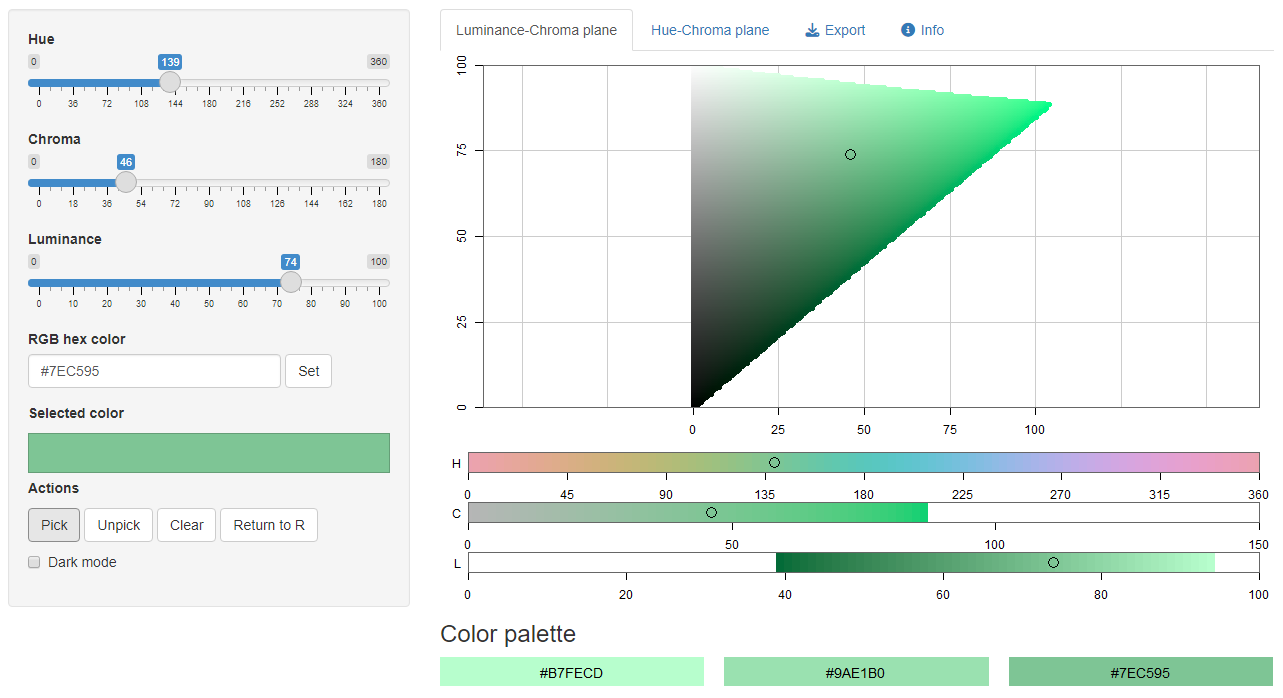
The colorspace package in R can help you create an aesthetically pleasing color palette for your plots.
Ordering
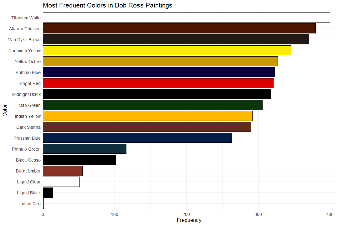
The orientation of elements on a plot heavily influences how a reader may process the information it presents. If elements are ordered in an unsuitable way, the plot’s meaning can easily be misconstrued or even misleading. In general, when your data has discrete categories, it makes sense to order the elements on the plot by numerical quantities such as counts, frequencies, or some other numerical value. The same idea applies to plot legends, you usually want your legend to follow a numerical hierarchy instead of the alphabetical order that ggplot defaults to.
Take a look at the difference between these two plots: one using proper labeling, color, and ordering and one made with the default ggplot settings.

Useful Packages
In addition to the fundamental concepts of data visualizations, this course also introduced me to some incredibly useful R packages.
The “patchwork” package helps R users consolidate multiple ggplot figures into the same graphic with a “ridiculously simple” syntax system. “Ridiculously simple” is no exaggeration, as the package allows users to flexibly and tactfully arrange different plots with simple operators (+, |, /), saving a ton of time, frustration, and code compared to completing the same task with vanilla R code.
Another useful package is “ggiraph”, which facilitates the creation of customizable interactive data visualizations that work seamlessly on web pages. Since it utilizes CSS and Javascript behind the scenes, it allows for tremendous flexibility to tweak the appearance of plot elements, as well as the opportunity to implement plenty of interactive functionalities. Its versatility can help data scientists create some really innovative and creative data visualizations, even if they aren’t experienced front-end web developers.
Lastly, the “sf” package helps R users plot and project their geographical data onto maps. Simple features, which “sf” is short for, refer to a set of standards that define how geographic features can be represented in geographic information systems. The package is fully compatible with ggplot, so once you have your relevant geospatial data, map-making is a breeze.
Geospatial Data
And speaking of geospatial data, the course had an entire week dedicated to the applications of plotting geographic data onto maps. When creating geospatial data visualizations, both the choice of geographical partitions and map projection can greatly influence the meaning of a plot. Geospatial data has many potential applications: you can show time series of land usage, socioeconomic trends, or the distribution of natural resources, just to name a few. Learning about this new world of data visualizations has been a blast, and I am looking forward to applying these newfound skills in a future geography-based project.

Throughout the semester, I’ve developed several new skills and the productive habit of never cutting corners when making data visualizations. The ultimate goal of any plot is to effectively communicate information, which sometimes can’t be accomplished with the default settings of most plotting softwares. A good data scientist has the discretion and discipline to augment plots in a matter that maximizes a reader’s understanding of the underlying data. Once familiar with proper frameworks and guidelines, you can create some really creative, interesting, and informative data visualizations.