Visualizing My Spotify Streaming History
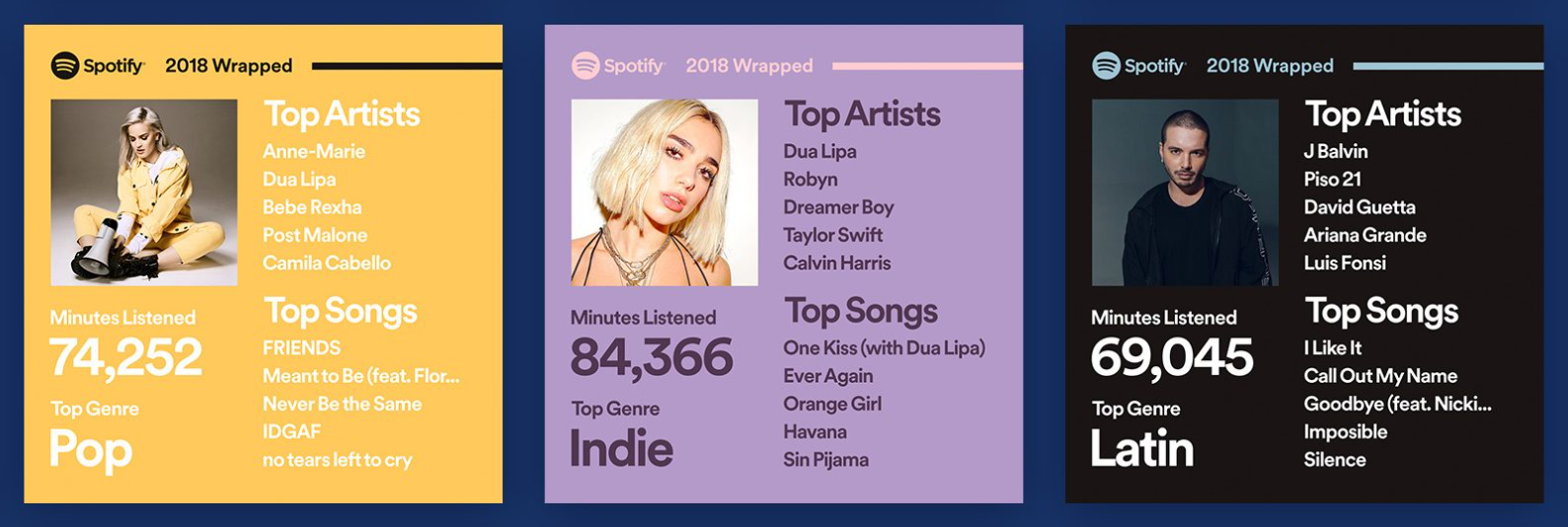
Every December, Spotify reintroduces its annual ‘Wrapped’ marketing campaign, giving users a chance to view their most streamed podcasts, genres, songs, and artists over the course of the year. This recap gives a decent overview of your listening history, but it still doesn’t quantify how much time you spend streaming each of your favorite songs and artists. Since ‘Wrapped’ wasn’t up to my standards, I used Python and Tableau to create a more comprehensive and intuitive version.
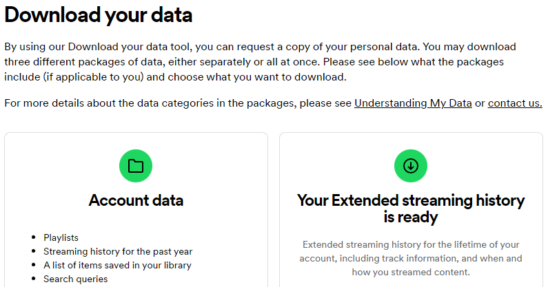
But before I could even start coding, I needed to find a way to get the data for my streaming history. I began by combing through the documentation of Spotify’s Web API, but unfortunately, I couldn’t find anything that returned streaming data beyond the fifty most recently played songs. While researching alternative methods, I came across an article by Anne Bode that served as a fantastic resource. Through Spotify’s profile privacy settings, you can request a copy of your streaming history for the past year, and even better, your lifetime streaming history. The latter had me thinking: What would my “Wrapped” look like if it included my lifetime listening habits? After two weeks of waiting for Spotify to process my request, I was finally able to dive into the data and find out.
Spotify exclusively returns streaming data and API calls in JSON format, which is basically the Python equivalent of nested dictionaries. The JSON files contained many useful fields, including the amount of time a song was streamed, the date it was streamed, the platform it was streamed on, and obviously, the artist and song name. However, it also came with a few problems: The most annoying issue I encountered was the way Spotify categorizes artist collaborations and songs on albums. For example, “Leave the Door Open,” a single from Bruno Mars’ and Anderson .Paak’s ‘An Evening with Silk Sonic’ album, was solely credited to Bruno Mars and had two different track ids in the JSON: one tied to the single version of the song and one tied to the album version. This meant that I had to query the Spotify API to make sure that both the single version and the album version were used when calculating an album's overall time streamed.
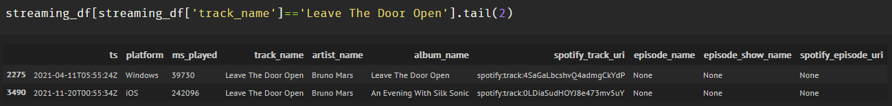
‘Leave the Door Open’ has two album types and two song ids
I went through this trouble because I was really interested to see my top albums of all time. On the other hand, I didn’t think that including time streamed for additional artists on collaborations would add anything too interesting, so I didn’t bother calling the API for every single song in my streaming history correcting that issue. You can see exactly how I tackled other problems as well as my top songs and artists of 2022 in the annotated Python code I posted to my GitHub.
Once I corrected the issue with albums, it was time to create an informative and appealing visualization. Before this project, I had never worked with Tableau, but Anne’s aforementioned article convinced me to give it a chance. After some trial and error, I was able to put together a neat dashboard myself. I’m glad I now have Tableau in my data science toolbox: its interactivity made for a much more intuitive and informative experience than what could’ve been done in matplotlib.

Preview of the Tableau Dashboard
This project has given me a great chance to practice with API calls, working with JSONs, and learning a visualization tool that I’ll definitely return to. Spotify may eventually improve Wrapped, but until that day comes, my Python code and Tableau dashboard provides the next best thing.