Texas A&M Grade Dashboard (Updated 2024)
For most of my college career, I would spend the weeks leading up to class registration researching the best possible professors for my upcoming courses. Part of this process involved the futile effort of combing through many RateMyProfessor pages reading skewed, unproductive ‘reviews’ that were without a doubt products of response bias.
If you want a more reliable source for professor and class information (and you’re an Aggie), Texas A&M’s Office of the Registrar releases grade reports following every semester. These reports do not contain the qualitative (mis)information you may find on a RateMyProfessor page, but they certainly provide some valuable information when vetting potential professors and courses. However, there is an issue with using the Registrar’s office reports: they solely come in PDFs, which makes it quite difficult to compare professors or courses.
Since I have never worked with PDFs as a data source, I thought it would be a fun challenge to extract important data into a more analysis-friendly CSV file. Describing exactly what I did to convert the PDFs may be a bit cumbersome, so if you’re interested in the process, I documented everything in the GitHub repository that houses all of the projects’ files (including python and R code and the final dataset).
The next step of the project was doing some very basic exploratory data analysis and brainstorming ways to format the dashboard I wanted to build. I was curious if the colleges across Texas A&M had different grade distributions, so I created boxplots for each college’s course GPAs for the past five years.

It appears that the College of Science tends to have the lowest GPAs on a semesterly basis.
I figured that making a dashboard to view individual courses would be very convenient for Texas A&M students, so I made a simple app to display the data with R Shiny. The app is quite simple: just input a valid department and course number, and the app will return and plot all data relevant to that course, including professor, semester, grade distribution, and GPA.
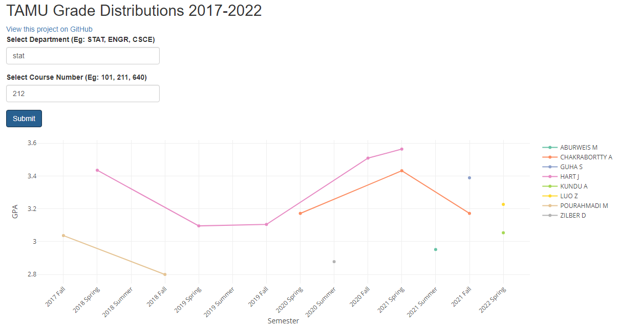
Here is the data for the course STAT 211. An interactive version of the app is available at https://rossw.shinyapps.io/tamu-grades/
My statistics capstone project involves analyzing part of this dataset to see if course GPAs fluctuate depending on class time. My intuition says that courses that start at 8 am may have lower GPAs on average, but a series of statistical methods need to be deployed to arrive at conclusive results. While we wait for an answer to that question, this dashboard will help students with their future course schedules and give a convenient way to view the messy reports from the Office of the Registrar.